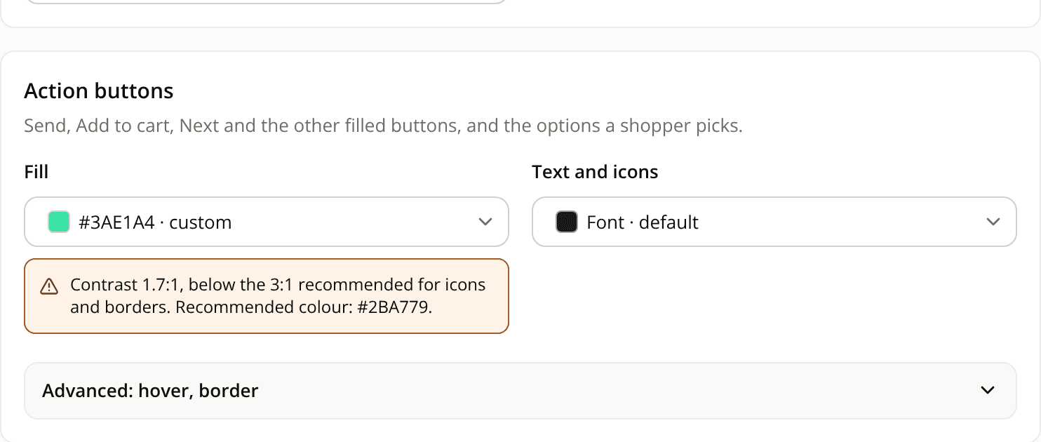
The contrast warning recommends a colour that passes
ChangedWhen a colour you pick is too faint for the surface it sits on, the warning under the colour field now ends with a recommended colour, such as "Recommended colour: #767676."
- Text (action text, visitor text, links and the like) is checked against 4.5:1.
- Icons and borders (action buttons, suggestions) are checked against 3:1.
The recommendation is the smallest change that passes: the first step toward black (or white on a dark backdrop) that reaches the threshold.
The field never blocks saving, and the colour is applied as you set it.
Resources