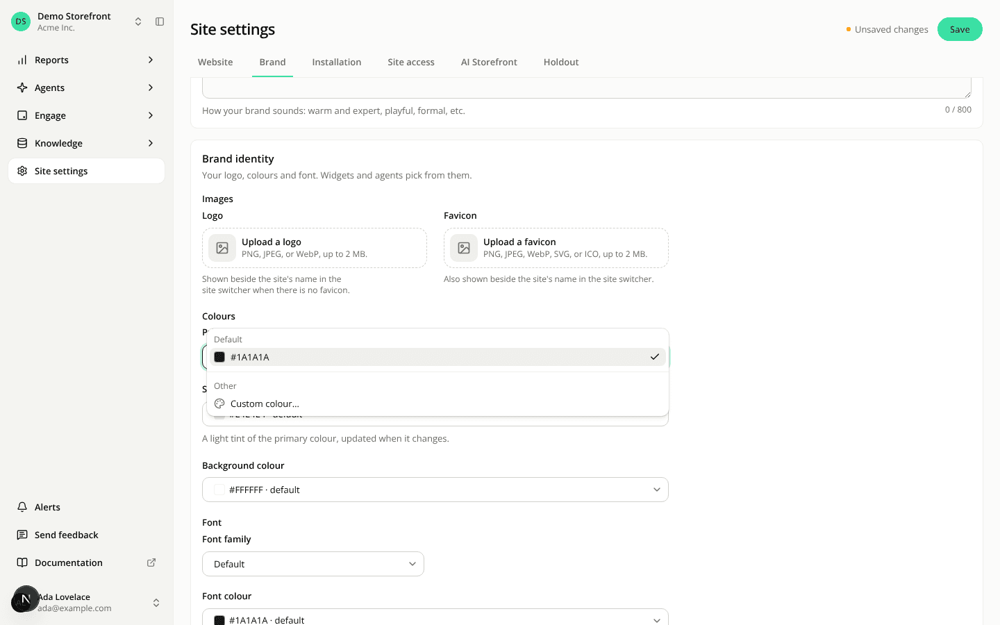
Brand colours use the same colour menu as the widget editor
ChangedThe primary, secondary, background and font colours in a site's Brand settings now work like the colour fields of a widget's Appearance tab.
Each colour says where it comes from. The field spans the card and shows a swatch with the colour in use: "#1A1A1A · default" when you haven't set one, "#DB2727 · custom" when you have.
Pick a colour from the menu. Open a colour to see Default and Custom colour…. Custom colour… opens the picker under the field, with a hex code input, an eyedropper in browsers that offer one (Chrome and Edge, for example), and a check to apply or a cross to cancel. Nothing is saved until you save the tab.
Default replaces Use automatic. To go back to the colour worked out for you, choose Default in the menu. The Use automatic link is gone.
The font colour warns about its default too. If the font colour reads at less than 4.5:1 on your background, you see a warning, including when the font colour is the default #1A1A1A on a dark background. You can still save. The secondary colour keeps a line explaining that it follows the primary, shown while it is at its default.
In French, Couleur principale is now Couleur primaire, the name the widget editor already uses.
Your saved colours don't change.
Resources