Style each part of your engagement widgets
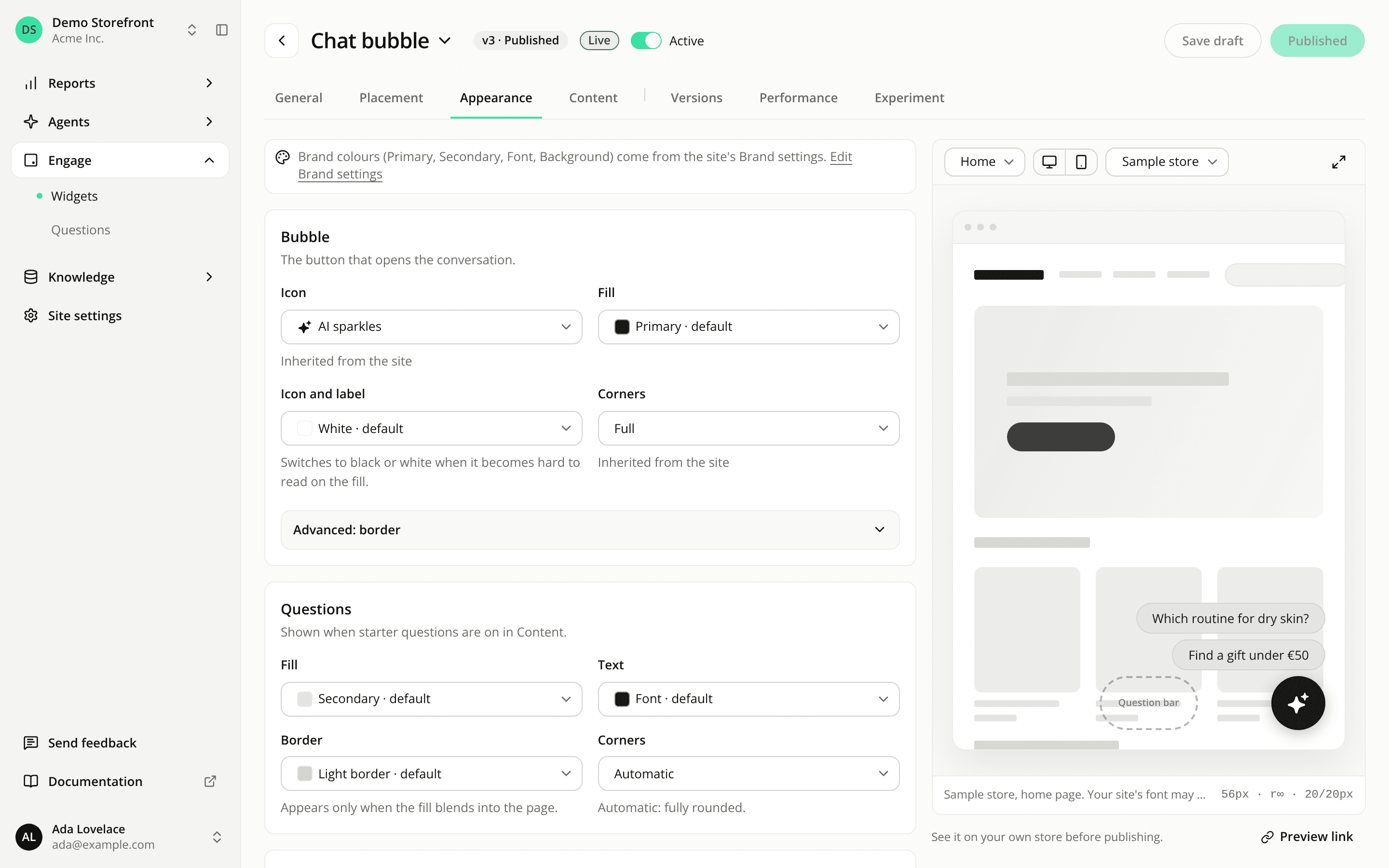
AddedA widget's Appearance tab now has one card per element your shoppers see, instead of one set of colours for the whole widget:
- Chat bubble: Bubble and Questions.
- Button: Button.
- Question bar: Question bar and Questions.
- Starters: Header, Questions and Question field.
A Size and shadow card closes the tab for every format. Each card shows its most used settings first, and folds the rest under Advanced.
Every colour picks a source. Automatic applies the element's own rule, picked from your brand and kept readable. Primary colour, Secondary colour, Font colour or Background colour links the element to your brand identity: change your brand and the element follows, with nothing to republish. None removes a fill or a border. Custom sets a colour for this widget only, which stays put when your brand changes.
Starter questions get their own style. They now use your secondary colour by default, instead of the reverse of the widget's colours, and you can set their fill, text, border and corners. The Starters question field gets its own border and corners too.
Borders when you need them. A chat bubble, a button or a starter question gets a light border only when its fill blends into a white page. A white question bar gets a light neutral one, so it stays visible. You can set your own colour or remove it.
Hide the icon. A Show icon switch on the Bubble, Button and Header cards. A chat bubble without an icon needs text in at least one language: the editor says so under the switch, so it always shows something to click.
Contrast warnings follow the text. When you choose a text colour yourself, the editor warns below 4.5:1 against the fill it sits on. You can still save.
What changes on widgets you already published. A few automatic rules apply to them straight away, without a publish:
- Their starter questions take your secondary colour, with a light border when that colour is close to white.
- A question bar, and a chat bubble or button whose fill is close to white, gets a light border.
- Text and icons on a light fill use your font colour instead of plain black, when it reaches 4.5:1 contrast there.
Colours you customised on a widget before today keep their value and show as Custom.
Resources