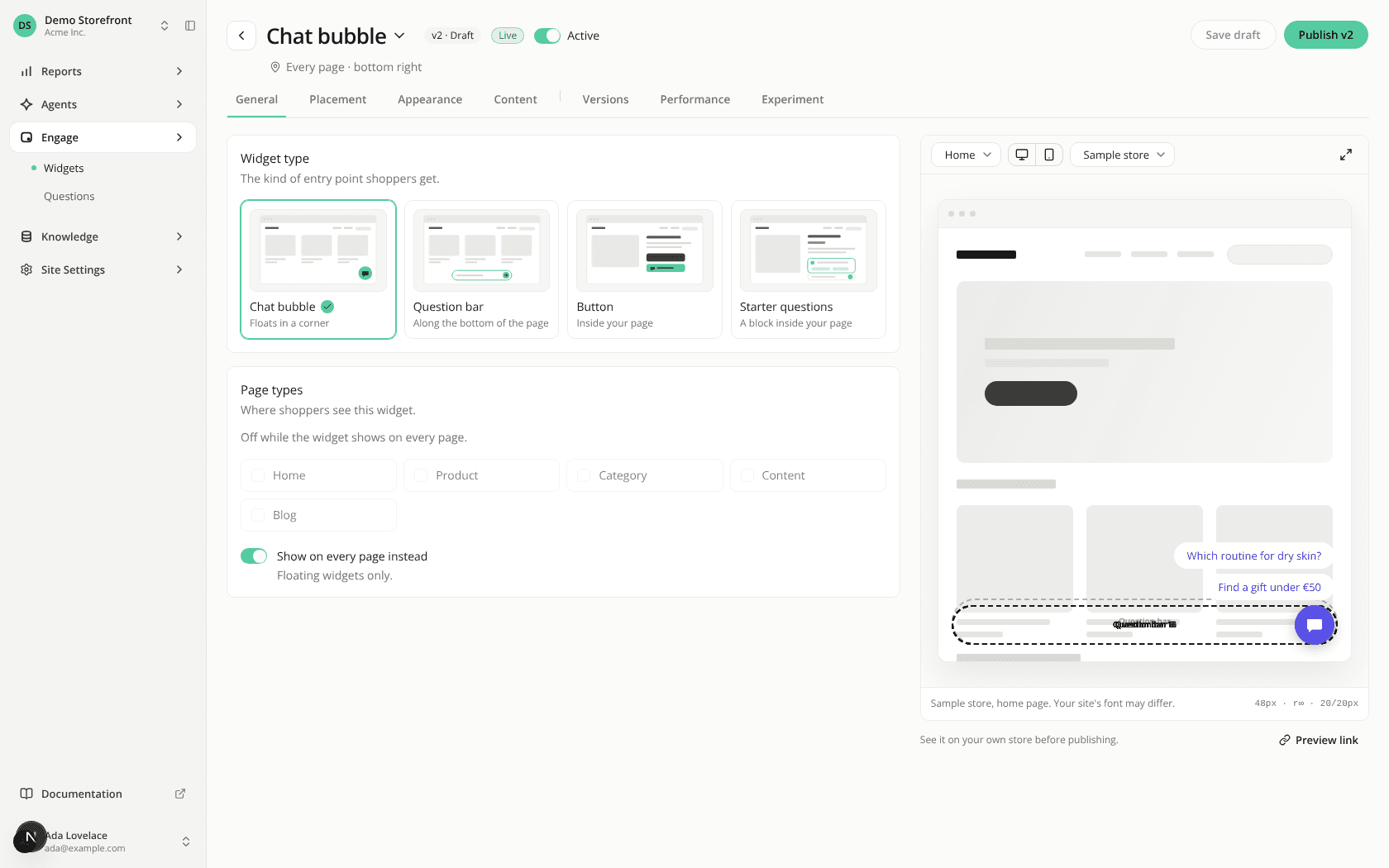
A clearer engagement widget editor
ChangedA widget's page has been reorganised around the questions you ask while setting one up. Placement gets its own tab, the preview gets a fixed place on the right, and the actions sit in the header.
The header tells you where the widget stands. The widget's name is the page title and a menu: click it for Rename or Delete widget…. Next to it, the version you're editing, the status (Live, Offline, Never published, Needs setup) and the Active switch, which still applies at once and never touches your draft. Under it, a Preview link active badge when a storefront preview link is still out, and a line saying where the widget appears, such as "Category and Product pages · bottom right". That line follows your edits before you save.
Four editing tabs, in the order you work.
- General: the widget type, as one card per format, then the page types as tiles. Chat bubbles and question bars get a Show on every page instead switch under them.
- Placement: where the widget sits. A chat bubble or question bar gets its position and offsets, with narrow screens and stacking order under Advanced. A Button or Starter questions widget gets the three ways to find its spot as cards, ranked from most to least reliable, with the chosen one's fields inside its card, then a check against a real page.
- Appearance: colours, shape and icon. Each colour picks its source, Site branding or Automatic against Custom, and an info icon explains the three.
- Content: the text in each of your site's languages, one tab per language, with a character count and the starter-questions switch.
Versions, Performance and Experiment follow, after a separator. The preview stays on the right on every tab.
Save draft and Publish in the header. They sit on the right of the header, with an Unsaved changes marker when you have edits to save. Cmd+S or Ctrl+S saves the draft from anywhere on the page. The storefront Preview link sits under the preview, after its caption.
A preview you can trust faster. Its controls now sit in one row when it fits, wrapping rather than scrolling: the page being simulated, the device, the language, then Sample store or Your site. It opens on a page your widget actually targets, so you no longer land on a scene where it's hidden. Expand preview opens it at full size.
Resources