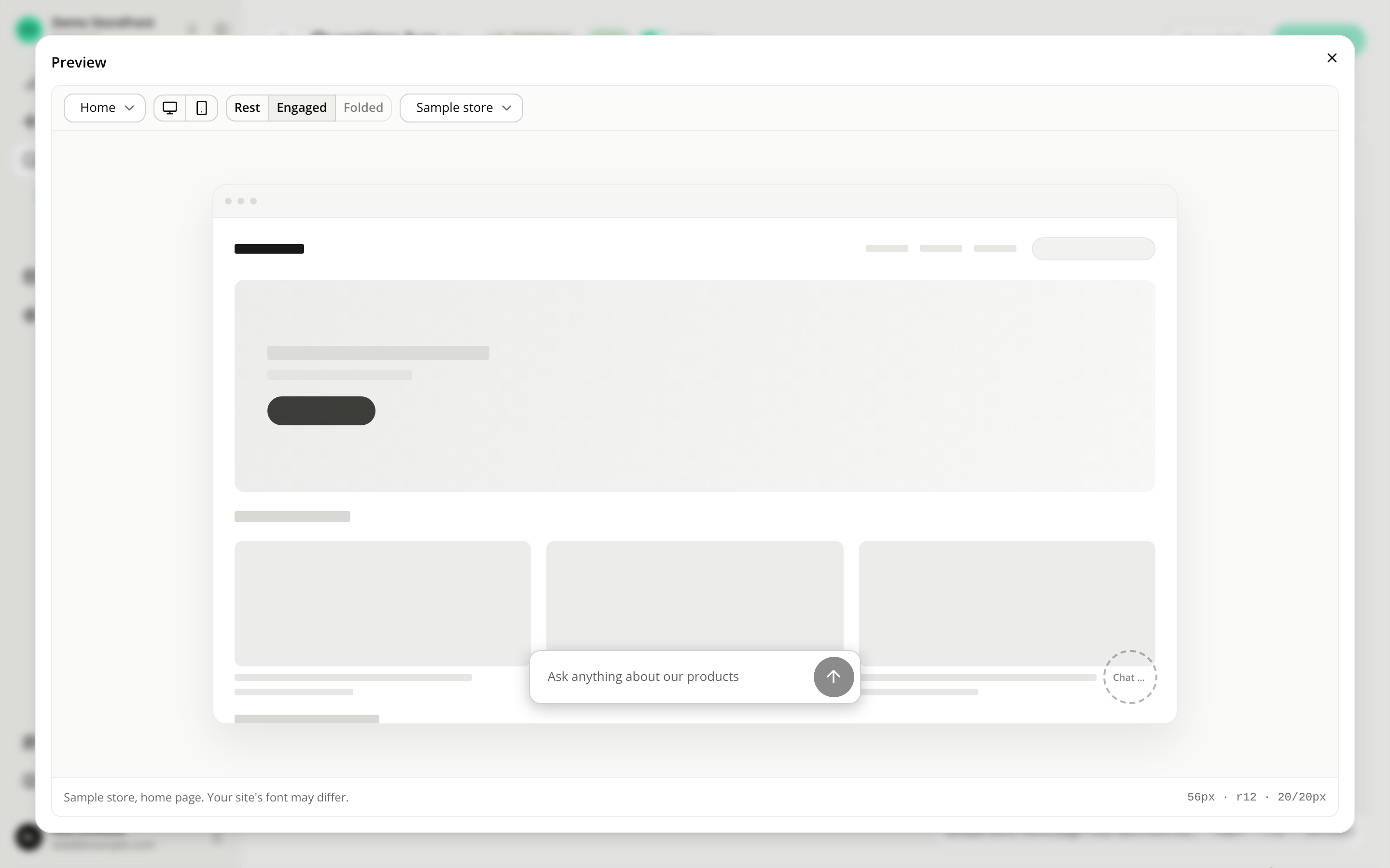
The question bar's width follows the shopper's screen
FixedThe question bar was 280px wide whatever the screen: a narrow strip in the middle of a laptop, and smaller still on a large monitor. Resizing the window changed nothing, and turning on starter questions could widen it, because the longest question decided its width. The editor's preview drew it across most of its frame, a far larger share than shoppers got, so what you checked before publishing was not what they saw.
Now the bar's width follows the shopper's window:
- On a phone (under 512px), the window minus 16px on each side.
- On a tablet or a small laptop (512px to 1200px), 480px.
- On a wider screen, 40% of the window.
- Never more than 640px, the width of the conversation panel it opens.
The bar resizes with the window, with no reload, and starter questions shown above it no longer change its width.
The editor's preview now draws the bar at the share of the window your shoppers get. The Desktop frame shows it at 40% of the frame, what any window from 1200px to 1600px wide gives it, and the Mobile frame shows it spanning the frame minus 16px on each side. What the Desktop frame can't show is the 480px minimum on a small laptop and the 640px maximum on a very wide screen.
In a window narrower than 632px (a phone or a small tablet), a chat bubble at its default size and side offset sits within the bar's width, so at the same bottom offset the two overlap. Those windows are all below the 768px breakpoint, so a narrow-screen bottom offset on one of the two separates them.
Nothing to change on your side.
Resources