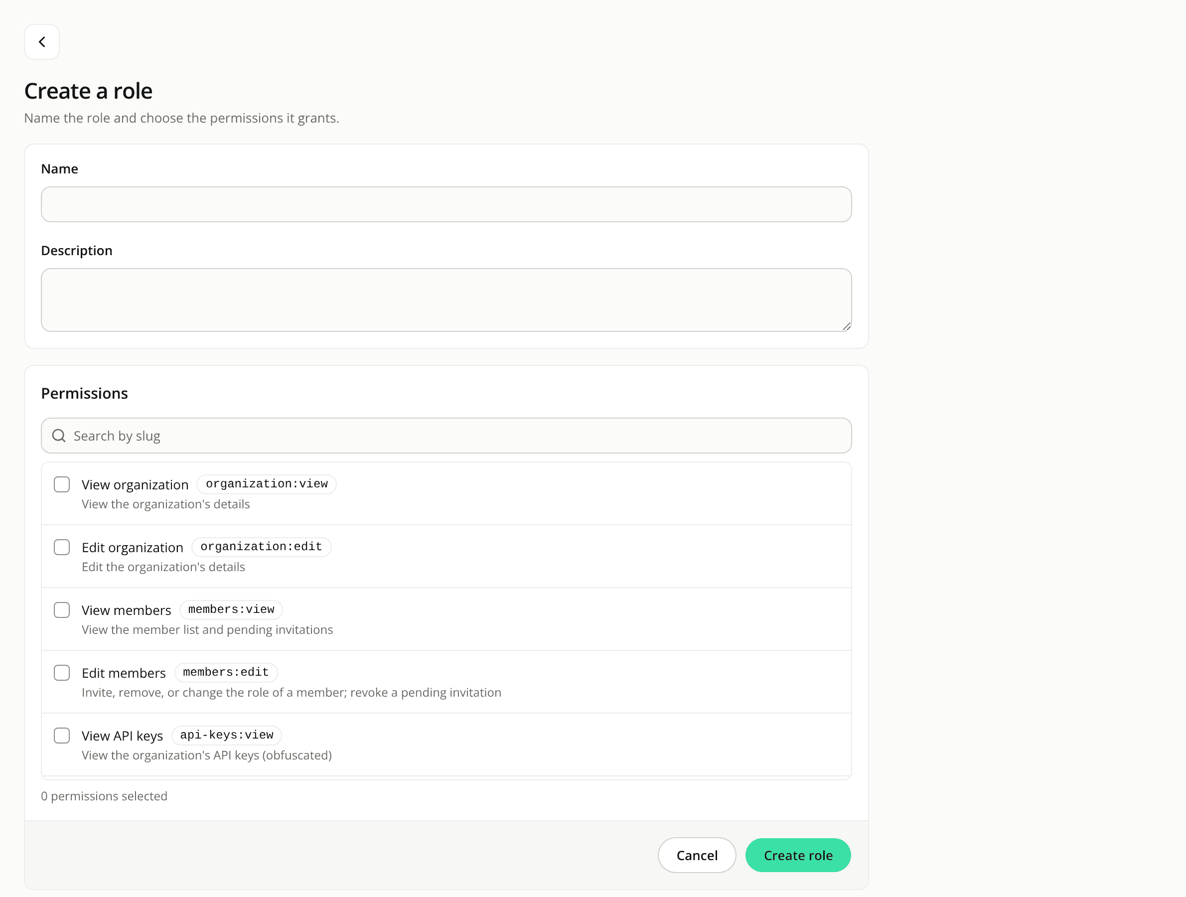
A more consistent dashboard
ChangedThe dashboard got a visual pass so that every screen follows the same rules.
Statuses read the same everywhere. Success, warning, information and error now each have one colour, used for their text, border, icon and tinted background on every screen. Before, some screens used their own shades of green, amber or red. Link buttons are now blue rather than green, so they stand apart from the green action buttons.
One type scale. Every page title has the same size and is the largest text on its page, and body text, card titles and small print each have a single size. The sizes are in rem, so they grow or shrink with the text size set in your browser.
Sections sit in cards. A few screens that still had loose content now put it in cards like the rest of the dashboard: the role form (name and description in one card, permissions and the save buttons in another), the agent and version pickers of the evaluation launch form, and the note about commerce figures at the bottom of the Engagement report. The Engagement report also drops the "What opens a conversation" heading above the starter questions table.
Your shoppers see no change. The chat on your hosted page, in the embed and in the playground's chat panel keeps its colours, text sizes and corners. Your site's own brand colours still apply there.